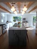
This is how it currently looks. Not bad. Well, now that I've got that Chinoiserie pagoda mirror (that I picked up from a local online auction for a song), I feel like I need more vivid walls for it to pop against. I know, crazy.
My inspiration?
Ashley Putnam's dining room from Lonny.
And, I have these nice linen curtain panels I picked up at an estate sale for $20 for the pair.
 | |
| They're not hung correctly. I just threw one up to see what it looked like. My plan is to have put Greek key trim around the edges, like so . . . |
Except, I think in orange . . .
to contrast with the blue walls a little bit.
I even went to the Sherwin-Williams site and played around with their Color Visualizer . . .
Okay, so I didn't do that great of a job, but it gives you a general idea. Just squint. And this isn't the exact color I was going for either. Something a little more saturated like the Benjamin Moore color above (Champion Cobalt). This is Sherwin Williams' Regatta.
So, am I crazy? Or at least crazy in a good way? Please tell me I'm not alone.
Sources: Lonny, House Beautiful, M&J Trimming, Sherwin-Williams


30 comments:
You are not alone. I like the cobalt better. And I like those white panels. I need to go to estate sales.
I am really liking the direction you are taking this room! It is already pretty but I think with an injection of a great color on the walls..its going to be over the top! Love the idea of adding the greek key to accent the panels...will be gorgeous! Can't wait to see what you do..keep us posted!
you missed a spot...
honey, I might have you beat as far as how often I change it up...! I like your current color. beautiful and elegant. that mirror is totally wow! please, please tell me about that big abstract art. I LOVE THAT. donna
you're definitely not alone! the room is so pretty now but i think the deeper blue would be amazing! the mirror & drapery panels were such a score!
If you get tired of painting and moving stuff at your house, just come to mine. I live close.
Laura
Not crazy at all, and unfortunately I too am afflicted by design ADD. Go with the blue, though. It looks fabulous.
You sound perfectly sane to me. But, then again, I'm not certain I am, so you should take that with a grain of salt. ;0)
I think your dining room is so, so pretty and certainly doesn't need any work, but that's never stopped us before, right. You're right, the darker, richer hue would add a wonderful infusion of drama and make everything stand out all the more. Especially that amazing mirror you snagged. I love the idea of adding a touch of orange in the greek key. So lovely, Kathy. You have a terrific play of traditional and modern happening here.
Yes, crazy but in a good way!! And I LOVE your mirror! The good news is we can be crazy together. Once I finally hung my Atoll mirror I realized I needed to paint my walls to make it pop...one thing leads to another...
Your dining room would look amazing with these dramatic blue walls! You have enough lighter elements in the room to keep the space from becoming too dark. I noticed that your ceiling is painted... are you planning on changing it? Your inspiration pic has a crisp, white ceiling, but perhaps a shade similar to your lovely linen window treatments and upholstery fabric would look fresh and intentional.
I had that almost exact color of blue in my dining room in my last too houses and LOVED it!! I also had the long white drapes too but you have definitely plussed it with the trim. Love that too. It really is a great color and I miss it in my current home. I used Pool House Blue from Martha's first paint line with KMart (if that tells you how long ago I did it.) It will make the room dark but it will be dramatic and cozy. Do it!!!!
Nah not crazy, but be careful, dark blue is a tough one to get right. Don't cheap out... make sure you buy lots of samples! I bet when it's done it will look fantabulous.
Love the greek key idea too :)
I agree with Wendi, she has a great point about painting the ceiling the same color as the curtain panels to make things look fresh and intentional. I think painting the wall blue would be a fabulous idea. It's lovely now but painting it blue will certainly add more drama and contrast with your existing accessories. So, go for it. Looking forward to see the transformation.
Great blog, by the way. A new follower.
Jessie
www.mixandchic.com
I love the Greek Key in orange! I've been loving blue walls, especially Peacock blue, since I first saw this Colette Van Den Thillart's house. Amazing - I blogged about it here - http://cooper-grey.com/2011/04/06/the-lovely-home-of-colette-van-den-thillart/.
Hope you're doing well!
me again. I'm gonna bug you until you tell me about that painting. also? just noticed your lamp. I have THREE just like it. different shades, tho.
donna
Kathy, I love your DR! BUT....I have been changing things for 25 years so I am not the person to ask. I do love that dark blue, but I am with Naomi...make sure you get the perfect color. Pressure is on now right! I think with a white ceiling and the white drapes it will be beautiful.....so keep us posted on the choice. You could actually blog about picking out the color for a good month.
Kathy- Wow, how fun is that visualizer! The brighter color looks really great. Perfect for a dining room. Like your curtain idea, too!
Loretta
I really like the dining room in it's current state, but I like your vision for it even more. The blue walls, the orange trim on the drapes...I really hope you do it! Now I'm off to play around with that visualizer!
I think the blue from the Lonny magazine will look great. You can also change the lampshade. I bought a lampshade form Homegoods and had it painted. Here it is in my blog near the window in our family room. http://dinisaha.blogspot.com/
I love the cobalt walls! Seeing it in the last mock-up makes everything pop.
I feel your pain as most others have said. I am constantly moving things around so much I can never call a room finished.
I love it! It think the darker color makes a huge difference in the room. Can't wait to see it!
Lori
www.lorimayinteriors.com/blog
HI, I just found your blog and I am so happy I did! We have such similar taste. I love what you are doing with your dinning room. The color is fantastic and the greek key idea is fab.
I just read your previous post on the brass finds. I just purchased the exact same brass herons!
Take Care,
Heather
I hear ya with changing it up, and know that you are not alone! Hope all is well with you and you are having a great summer!
You are so not alone- and I love that blue color- I say go for it!
PS- you won the giveaway on my blog- come on over to see :)
How gorgeous! Who says it's crazy? Have a fabulous day, Kellie xx
You're not alone!! Go for it - seriously, I really like it. You're headed in the right direction!
Thanks, everyone! Sorry I'm just now responding. We're currently on vacation. I really appreciate everyone's input!! Can't wait to get started on this project! And Donna, the art in our dining room is by Anton Weiss. We love it! It was the first real piece of art we bought almost 6 years ago.
Thanks!
Kathy
Oooohhh...I really like the blue walls. I've never seen that color visualizer before. What a great tool! Can't wait to see what you decide to do with the space.
Isn't the color visualizer the best tool? Your room would look amazing with that shade of blue.
OK, I love the current room. But, I change things a lot, so I don't think your crazy, just someone who likes change. I think the blue could be great too, but it's great now (to me). If you are looking for pretty blues, Farrow and Ball has a yummy one! M.
Post a Comment