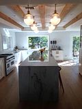
Here are a couple before shots (with the prior inhabitants' furnishings and accessories):
We didn't have a ton of money to spend on a total kitchen re-do, and overall, the layout of the kitchen was fine. So, I went with what I thought would make the most visual impact. I had the cabinets painted and new counter tops and a new backsplash installed. Oh, and we got a new sink and refrigerator but kept the rest of the appliances (for now).
So, without further ado, here's the way the kitchen looks today . . .
Overall, I'm very pleased with my kitchen . . .
I would have loved to have had carrara marble counter tops, but I went with cream for the cabinets (white seemed too stark for this house) and I don't think the white marble would have worked. So, maybe in my next home, I'll go with the all-white dream kitchen.
I must say my favorite part of the kitchen is the backsplash. They're hand-glazed caramel-colored ceramic subway tiles from some California-based company (the name escapes me now). I love them. Of course, there's more that could be done (pendant lights over the island, a gas cook-top and a fancy stainless vent-a-hood), but for now it makes me happy.


7 comments:
what a difference!! It looks like a totally different room!! I am loving it!!!
Thanks, Sissy!
LOVE your kitchen! You did an amazing job! xoxo
Ditto! I am quite partial to the counter tops. I wonder why? It really was a dramatic change but seems like it was always meant to be that way.
Much improved...cleaning that prior tile grout would have made me insane.
Wow! Great improvement! And, I'm loving that bamboo light fixture. Would you mind sharing where it came from?
Looking good with your new kitchen! I especially like the color combination you chose because it’s very light on the eyes, and will really set your mood before a meal. I also do renovations on our kitchen with the assistance of my wife. She dictates and explains the details while I execute them.
Bronwyn Hass
Post a Comment