Wednesday, August 31, 2011

In the Bedroom

Ooh, doesn't that sound sexy? I came up with all kinds of titles that sounded much more suggestive, so I thought I would keep it simple and fairly clean. Bedrooms have been on my mind a lot lately mainly because I finally got an upholstered headboard. Whoot-whoot. Very exciting. Here it is . . .
It's the Scroll Headboard from West Elm. I got it on a whim as an anniversary present last month because A. it was cheap/on sale, and B. I've been wanting an upholstered headboard for SO very long. West Elm will not be selling these in stores anymore - only online - so they were selling off the last of their inventory of the "in-stock" natural chunky basketweave fabric, which luckily I liked.  I got it for a steal - $200 because it didn't have hardware with it (it would've been closer to $250 with it). The headboard sells online for $549 plus shipping. Score. Now, I realize if I were crafty and bought plywood, batting, fabric, etc. and made my own headboard it might have been cheaper, but it also wouldn't have ever been finished due to personal bodily injury or general aggravation. This was totally worth it for me and my instant gratification needing self.

I actually paid for the headboard by selling my old sleigh bed on Craigslist. Here's the old bed:
I know it's an acceptable bed, but after eight years I wasn't wild about it. Time to move on.

I think my new headboard resembles this one featured in a Kay Douglass-designed home in the September issue of Veranda . . . although this one is custom.


I recently picked up a Batik fabric at an estate sale (that I think might have been a tablecloth), so I draped it across the end of the bed for a little Bohemian vibe . . .
I, of course, need to pick some bedding. I still have the Hotel bedding from Restoration Hardware featured in the photo of my old bed, but I stripped it off for this photo (that's just a plain down comforter on the bed and plain pillow forms). I bought the gray linen "M" pillowcases at an estate sale for $8 for the pair. I'll also need a bedskirt/dust ruffle since I no longer have a bed with a frame (just a metal bed frame attached to the headboard). I imported the benches from the living room because I love a bed with a bench/benches at the end. If I decide to keep them here, I will need to also decide on a fabric to reupholster them in. More decisions! I also need to decide what to do behind the bed. Since the headboard is rather large and dramatic, I'm not sure how much is needed. Oh, and I need curtains.

West Elm styled the bed with a gallery wall behind it. 
I like the look, so that's a definite idea.

Here are some of my inspiration bedrooms . . . 
Source: flickr.com via Kathy on Pinterest

I love the play of patterns and textures in this space, and of course, the Chinoiserie bench with suzani fabric. I also like the small white sunburst mirror above which resembles the gold-leafed one I have. I'm not sure a sunburst will work with the shape of my headboard or not. I still have to play around with it.
Source: flickr.com via Kathy on Pinterest

A lot going on, but I like it. Another gallery wall AND a sunburst, plus wallpaper, plus a lot of pattern. Crazy but it works.

I just love the next two rooms even though they bear no real resemblance to mine. It's the overall feel that appeals to me.
Source: flickr.com via Kathy on Pinterest

Source: flickr.com via Kathy on Pinterest

Now, I'm definitely not changing the color of my walls as I love my Ashley Gray (Benjamin Moore). It's hard to tell from my photos because I took them in late afternoon, but there is more of a contrast between the wall and headboard than it seems. And I'm actually digging the neutral palette for the bedroom with just some pops of color.

After I saw this photo from Lonny, I had another crazy thought . . .

How about this?
Yeah, I don't think my husband would go for it. I've got some other ideas up my sleeve, but I need to slow down and process what's on my plate right now.

So, do you think I'm headed in the right direction?

Monday, August 29, 2011

Crazy Good or Just Plain Crazy?

Before hitting the flea market on Friday, I stopped by a few estate sales. As usual, I had more luck at the one I just "happened" upon after seeing a sign on a street corner. I found nothing at the Flea Market. Nothing. Nada. I think I was just too hot and distracted. Oh well. On the way home, I hit a junk/antique store I had never been in before and found this . . .
Am I nuts for liking this? I've never seen anything like it, which I must admit was part of the allure. Of course, the Asian influence didn't hurt either, plus the bamboo/glass frame - so unique. It's a needlepoint piece which intrigued me even more. 
I think it would look great as the centerpiece of a room. I love the glass detail because it would allow your wall color to peek through and provide a contrast.
Needlepoint has experienced a resurgence in popularity lately in great part thanks to Jonathan Adler and his quirky and quaint needlepoint pillows that he uses throughout his interiors . . .


I love the homespun quality of needlepoint juxtaposed with modern patterns.

Some other little goodies I found at the aforementioned estate sale include an unframed oil or acrylic painting . . . 
Really like the colors in this one.
a framed piece of painted silk artwork . . . 

and lastly, a small mid-century bench which could use some new upholstery, but I love the shape.
All these pieces will make an appearance in the blogger Tag Sale (unless I decide to keep the stool for my son's room) we're hosting on October 1st. I know I keep teasing this, but I promise we'll be sharing more details soon (like the location and time) once details are hammered out. 

Hope everyone has a Happy Monday!

Thursday, August 25, 2011

Good Things or Rip-Offs

Have you checked out the new Martha Stewart Living magazine?
I usually don't pick it up, but this issue is full of "good things," to quote Martha. I think the big title "Love Your Home: Style Ideas for Every Room of the House" was a clue I might like it more than her usual issues (which are often just too crafty for me making me feel inadequate - who needs that?).

Oh, sure there are crafty DIY things in there, like these cute monogrammed headboards:
I, of course, while liking the headboards mainly think, "I love that lamp." Then, "cute dog." The takeaway here - while I can appreciate a good DIY, I'm not going to tackle most of them. Sad but true. I just like to study the styling and interiors. I know my place and I'm comfortable in it. Another cute photo from this story about monograms:
Sorry for the quality, I snapped this with my camera.
Doesn't this remind you of a Miles Redd room? Not totally, but the saturated tones and painted shelves are reminiscent of him, I thought. No big deal. Everyone does this look now, and I still love it. However, they even used Farrow & Ball's Hague Blue (and not a Martha color like they do in most of the spreads) like Miles did in this rather famous room featured in House Beautiful in 2009 . . .
But then, I almost gasped when I saw another photo in a feature they did on spiffing up interior doors (also another very Miles Redd thing to do). Check out this photo from MSL:
Sorry, once again, for my photo.
And now a photo from the Miles Redd-designed apartment in House Beautiful (same apartment featured above): 
Um, pretty clear they copied this entire concept. Miles' doors were covered in green leather, while Martha's doors were simply painted, but the brass upholstery tacks, hallway wallcovering, zigzag floor covering, and DeGournay-esque wallpaper (or treatment) in the adjoining room are all extremely similar. I understand that imitation is the sincerest form of flattery, but couldn't they have at least credited Miles Redd or asked permission to use his photo as a reference ("how to create this look on a budget" kind of thing)? I realize there's no such thing as an original idea, but this seems like a pretty blatant rip-off to me.

Don't get me wrong, there are some great ideas and eye candy in this Martha Stewart Living. And they, of course, do a great job of educating you on how to do these decorative treatments yourself, I just wish they were a little more original or honest in their presentation.

Am I the only one who thinks this is a little like creative plagiarism?

Sunday, August 21, 2011

One of Those Weeks

I try not to complain, but I'm glad the past week is over. It was one of "those" weeks. I was ill most of the week (nothing major, honestly), but the most upsetting thing is that we had to re-home or adopt out one of our beloved dogs. It's a very long story that I won't go into, but suffice it to say that she needed to go live somewhere else so she could live a happy and well-adjusted life. It was a horribly sad and depressing decision to make, but we know we did the best thing for Coco. Thanks to the Chattahoochee Valley Bernese Mountain Dog Club for placing her so quickly. We'll always love you, Coco.
Coco is on the right. Piper is our golden retriever. This is an older photo. Piper is much bigger now.

Also, this big guy finally started Kindergarten on Thursday.  Bittersweet for sure.
His assessment of school so far (he's only been been two half days)? "It's fun, but kind of boring. The teacher just wanted us to be quiet all the time." Sounds about right.

On Friday, I was able to hit a couple of estate sales before picking him up at noon. It raised my spirits a bit. Here's what I found . . . 
This hand-carved decorative wooden wall-hanging with gold-leafed peacocks. It's pretty heavy and very unique, I thought.

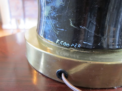
This awesome (and massive) hand-glazed ceramic black marbleized lamp. It needs a new shade for updating purposes, but it's in great shape. It was made by the Frederick Cooper Co., which I honestly didn't know much about. They're still around apparently and have been making quality lamps for decades. I'm assuming this one is from the 70's. If you look on 1st Dibs or eBay they are worth quite a bit. 

And lastly, some small accessories that I thought were charming . . . 
A mid-century C. Jere-style brutalist flower sculpture. It's either brass or copper (or some metal that doesn't attract a magnet).
And this small metal, mushroom sculpture. I just thought it was cute.
All these items (and more) will either go in my online shop or the tag sale that a couple of other bloggers and I are having on October 1 . . . more details to come soon, I promise.

Here's to a happy week for everyone!

Monday, August 15, 2011

$20 Can Go a Long Way

So, what does $20 get you these days? Or more to the point, what did I get for $20? For starters, this 3x5 wool rug at an estate sale . . .
I love it! It takes the place of a rather chewed-up rug my puppy got to. It adds a great vivid punch to my otherwise rather black and white entry and pulls in the blue of the adjacent dining room. I think it's a Gabbeh tribal-style rug from India (from my extensive eBay research), and the lady who sold it to me said she bought it from ABC Carpet & Home in NYC. I think I got a deal!

My next $20 purchase, a pillow for my sofa . . . 
Well, I actually went back and bought another one after I decided I liked it, so technically I spent $40 on two pillows . . . but I still think that's pretty good.
My home is not styled at all in this photo so there is crap on the table and in the kitchen. I'm keeping it real, people.
Here they are on my sofa. I've been needing a punch of color on my sofa for a LONG time but kept changing my mind about the fabrics I wanted for throw pillows. Now, these World Market pillows are not the best quality of course (rather thin cotton) and the inserts were pretty pitiful, but I changed them out for down inserts and I think it makes a world of difference. Of course, I don't think they match my rug at all, but for now I'm going on the delusion theory that all colors match. And yes, I know those columns in the background (that have to be there structurally so the house doesn't crash down) need to be painted. Once again, I was crippled by indecision for the longest time . . . that's a whole other post . . . but now I've decided to paint them to match the rest of the white trim in the house.

I'm loving my little $20 pops of color. Have you made any little changes lately that make you happy?

Sources: World Market

Wednesday, August 10, 2011

Show Time

Sorry for my recent absence. I traveled to my hometown of Memphis over the weekend for my 20-year high school reunion. I never know what to think about reunions, but I really enjoyed seeing the girls I went to school with two decades ago (I went to an all-girls Catholic high school). I could still recognize everyone which means we couldn't have changed that much - a reassuring thought! Anyway, I'm now getting ready for my older child to start school tomorrow and my younger one to start kindergarten next week (they do a staggered start for the kindergarteners), so I've been a little preoccupied. However, I have some interiors to share with you from The 2011 Memphis Home Showcase a couple of weeks ago. My sister was kind enough to go and take photos for me.

The first house apparently didn't have a lot of redeeming qualities, so Susan only took a couple of photos.  Here they are . . .
That's my mom walking in the back of the room. Not a lot to love in this room, pretty ordinary, but I focused in on the French doors. These are like the ones I want.
This bedroom seems a little under-decorated, but sometimes simplicity is a good thing. I really liked the small loveseat/settee at the end of the bed. 

The second house had an entire floor decorated by Amy Howard so it was more appealing overall. Although, as is the case with many showhouses in my opinion, it looks like they just threw some furniture in the room. This is especially true when one particular furniture store/manufacturer designs a space. There's usually much more variety when individual designers can draw from multiple sources. But, there's still some nice eye candy.
I, of course, was drawn to the art and asked my sister if she knew who the artist was. "It's Anton Weiss. Isn't that who painted the piece in your dining room?" she asked. Why, yes, it is. No wonder I like it.
This room lacks personality and looks like the undersized coffee table was an afterthought, but individually I like the pieces.
Looks like an Amy Howard showroom. Hard to see but the mirrored console is pretty.

I've seen this art before; can't remember the artist. Interesting sculpture on acrylic/lucite base.

Nothing new here . . .

or here.

I'm liking this coffee table.

Nice chairs.

A little too perfect.

Now, this, I like. At least they went out on a limb with the lighting.
Close-up of the floor lamp.

Pretty bed and bedding. Keeping this in my file for an upcoming post on bedding options.
Like the table, but not the styling.
This vignette has some personality.
Overall, some pretty pieces but nothing out of the ordinary. Well, we're off to the pool on my daughter's last day of "freedom." Hope you're enjoying what's left of your summer.