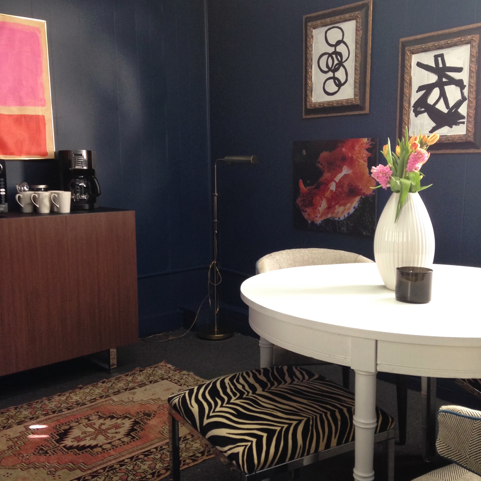
Please excuse the graininess - these are iPhone photos and the lighting is not the best (something I will tackle soon).
And a before so you'll see how absymal it was before . . .
Hello, boring beige and brown. That is his bachelor sofa - he hasn't been a bachelor in about 18 years,
so that tells you we were working with some serious leftover
furniture. Now, you might be asking yourself, "Kathy, how could you let the break area at your husband's office look so bad??" Well, the truth is, it was at the bottom of every list I had and at the bottom of his budget list as well. And while we accomplished this on a serious shoestring budget, it still cost money (that comes out of our pocket ultimately).
The other pieces, I honestly had nothing to do with either. I think they were things he picked up because they were cheap and readily available when they needed a table or shelf. Seriously.
So, we literally threw out all the old furniture as it was fairly broken and stained (put it at the curb with "Free" signs and it was gone within minutes). I picked out some new commercial carpet in a charcoal gray with hints of blue (this is a commercial building that he leases), had the walls and trim painted out in Restless Sea by Behr and then started layering in furniture and accessories.
I rearranged the layout of the room and oriented the new credenza from Overstock (the only truly new piece in the room) on the longest wall. Then I floated the $20 faux bamboo table from Craigslist (it was a heinous speckled yellow, so I just painted it white for contrast) in the middle of the room to allow for more seating. I brought in chairs and stools that I already had from estate sales to pull around the table. Still need a couple more chairs, but for now it will do.
I accented the room with vintage rugs (also from my stash - the smaller one I just got at an estate sale this weekend) and pulled in oranges, corals and pinks for accent colors (did I mention my husband is the only male in his office of six people) with the art and my husband's underwater photography.
I gave them a new little coffee/microwave station and added my homemade Rothko-inspired art (also inspired by Jenny from Little Green Notebook) for some color and interest.
Overall, it's done, just still needs some small fixes here and there (lighting and window treatment). I'm pretty happy with it, and the ladies who work there are thrilled, so it's a win-win. I hope you've enjoyed this little before and after.
Hope to see you sooner rather than later (as it's been lately).


23 comments:
Hot damn, it is (as I said on Instagram) the best looking break room I've ever seen. So fun, relaxing, interesting and the perfect place to recharge for a few minutes with a cup of coffee. Seriously good, Kathy.
Also, isn't it funny that the furniture we can't wait to get rid of (and don't think anyone would pay for) will get snatched up in a second as long as that "FREE" sign is out? People are crazy for free crap.
That's a break room? I was never lucky enough to work at a place that had this much style. Please come to the car dealership in NJ where I take mar car for check ups. It's a shit hole!!
Love it!! The best looking break room I've ever seen, I cold move right in!!
Kathy, it looks fantastic! Love the drama of the wall color. I just painted my living room and dining room a similar color but my husband would not hear of painting the trim anything but white - and he rarely protests so I let him have his way. But I digress. Love how the more feminine colors in the art and rugs contrast against the handsome navy wall color. And those chairs are fab too. I'm sure the employees will really look forward to lunch now!!
That color is sent straight from heaven! This is the best looking break room I've ever seen!
I like the picture of the imperial shrimp on the nudibranch.
Looks awesome Kathy. I could definitely take a break in that room. Love the art and the mirror!
Looks fantastic! I love the color and the rugs strewn around ... very fun and lucky for those on break!! xo
Kathy, this is so beautiful! What a great space to take breaks. The wall color is amazing.
it looks awesome!! talk about polishing a turd.
GREAT job!
I love everything about this home; decor, layout, modern aspect and especially that large opening to the beautiful back yard. Amazing!
Inspiring Wall Decal Designs For Kids Room
You knocked this one out of the park! I love the navy!LOL at Mfamb's comment.
Dayum ! It looks great. Shoot, I'd take that any day!!!
This is Very very nice article. Everyone should read. Thanks for sharing. Don't miss WORLD'S BEST CarGame
So clean and neat design!!! I love it
Indoor Marijuana Grow
This looks so clean and neat!
Things to do in Oahu
This is the place i need to chill!!
Found these Used Telephone Systems
So old design but still good! and i love it
Found these Starters
I wish i have this kind of rooms!
Web deals on Things to do in Oahu
Im very ok to live in this!
Web deals on Used Telephone Systems
So clean and neat house! I want to live in this
Web deals on Starters
Post a Comment